


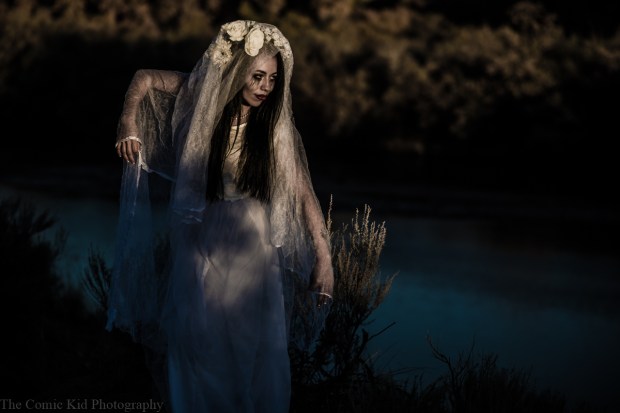


Anything can and will go wrong on a shoot, it happens and it happens to the best of us. On a recent shoot with Maxine things “went wrong” in that we couldn’t find the intended location, the area we were in had terrible weather and we were losing light pretty fast. When things like this happen it’s important to keep the spirit up and roll with the punches. With the initial idea being scrapped we drove down to Old Town Albuquerque to try and make up for a shoot that didn’t happen and the results were well worth it.
In the car ride (that got extended) Maxine, my assistant/girlfriend, and I had conversations about shooting women with curves (as Maxine obviously does) and how to get the best images out of it and we specifically talked about how it’s not hard to get great images with curvy models. Essentially when working with curvier models you don’t want to hide the curves, you want to highlight them and use them to your advantage. Curves can be incredibly flattering and work very well aesthetically but in order for get them to work you need to know how to pose the model. Posing is important for any model, it’s the basis of modeling in general and every model is different in what works but I’ve noticed that curvier models are very specific. You need to know where their curves are, where they look the most flattering and extend those areas out so that they get more of the attention than anything else.
Shooting curvier models is a lot of fun. It’s not nearly as challenging as you would think it would be and to be honest is more visually interesting to look at. If you want to get better at directing and posing I would recommend working with more models with curve because it makes you more attentive to what you are doing with your directions.

I don’t always edit my images in black and white… but some times I just can’t help myself. I never go into a shoot automatically knowing what I’m going to do in post processing. But once I’m sitting down playing around in Lightroom, the decision comes down to feel. This is most defiantly the case of my most recent Cafe shoot with Samantha Arellano.
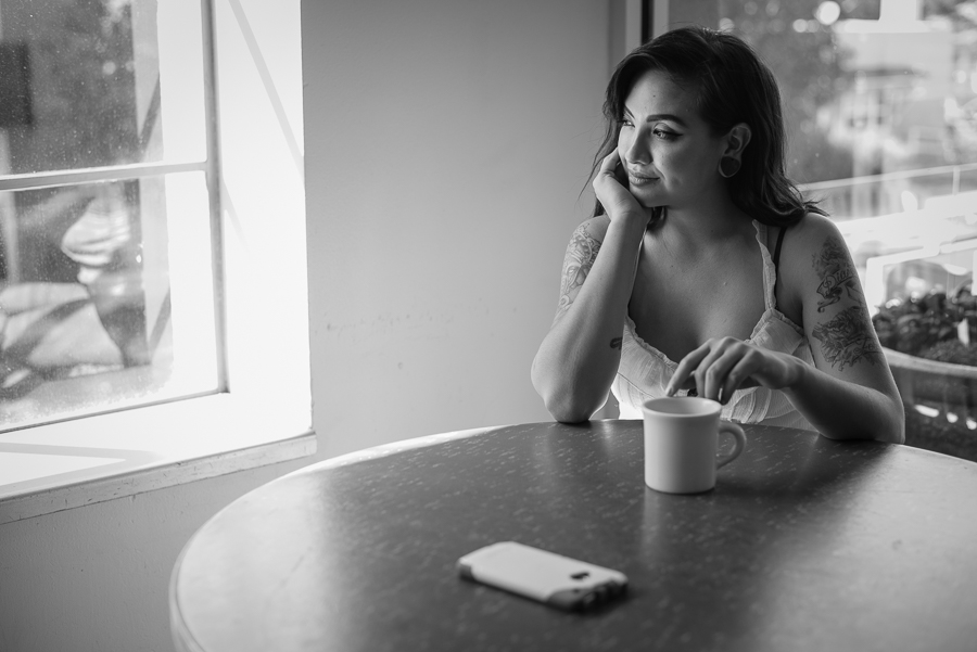
When I make the decision to edit the images in black and white itnormally comes down to one question: is it working better than the color version? I have a particular style that involves having very detailed images with high levels of contrast. Some times this will results in vibrant colors but often they can also become very muddy. If I don’t feel like the image has good color I’ll switch it to black and white and a lot of the problems I was having will go away.
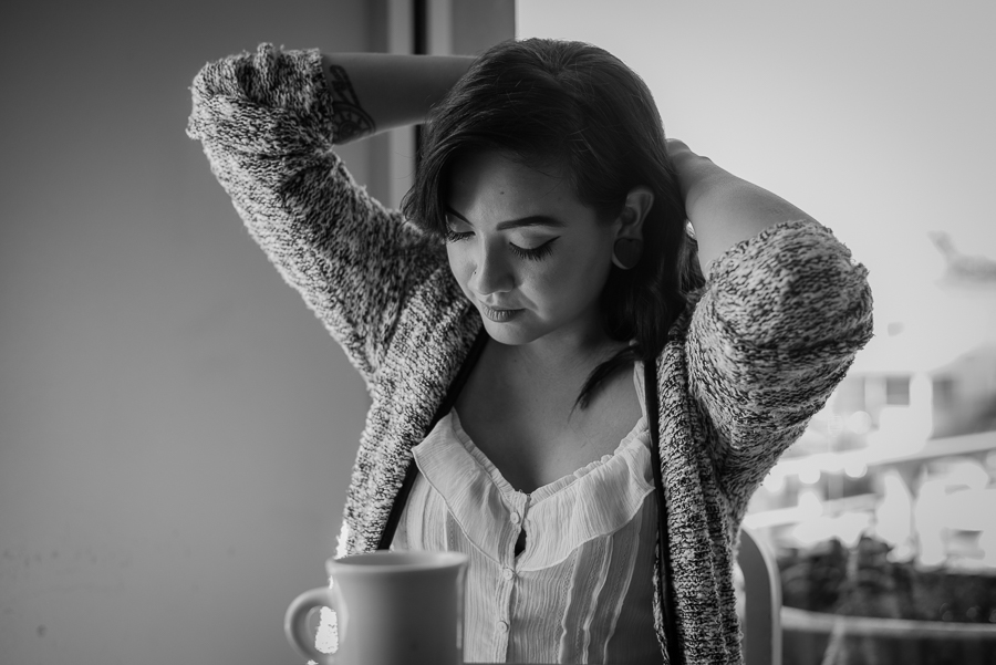
Another reason I will switch to black and white is if I had to shoot at a high ISO. This wan’t so much the case in this photo shoot but often when I have to shoot in conditions where I need to be at something like 3200-6400 I’ll opt into black and white 99.99% percent of the time. This is mostly because when you shoot at the higher ISOs you start to introduce noise and the color detail begins to fall apart. When you’re in black and white that color detail is irrelevant and the noise begins to look more like film grain than it does digital artifacts.
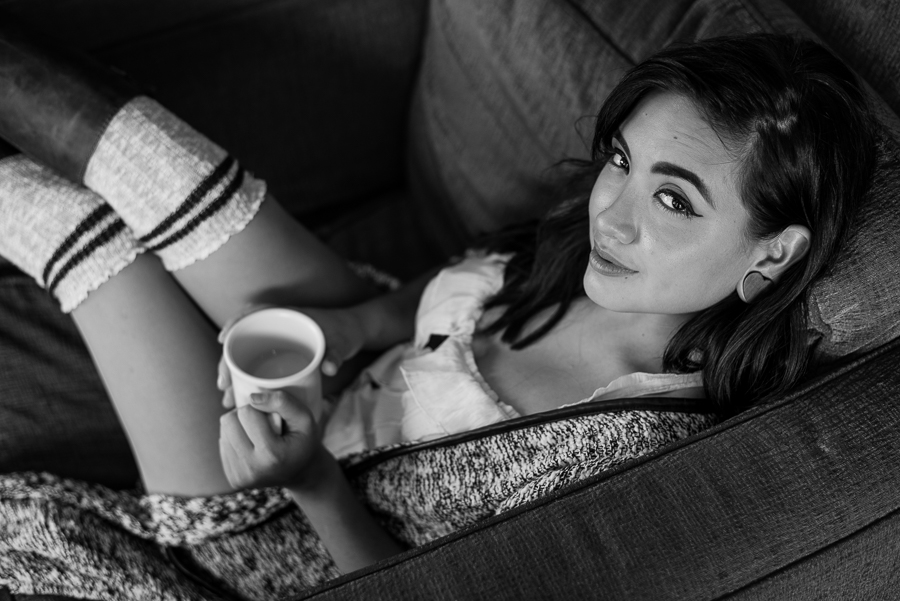
Another thing going to black and white helps with is removing distractions from the background. With on location shoots gaining control over a background is practically impossible. Busy color schemes, bright highlights and distracting elements all become less of an issue with black and white images, so it’s not hard for me to opt into a black and white photo.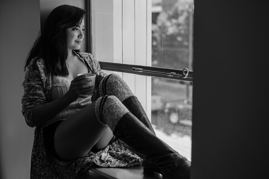
Now black and white is clearly a style that is as old as photography itself and clearly can’t be considered original. A common thing I’ll hear from models after handing in images is that they’ll say “I love this photo, can get it in color.” It’s taken a while for me not to get offended by those kinds of statements but It’s a common thing for artist to hear people to ask for changes especially when they don’t understand reasoning behind your decisions.

Sometimes it doesn’t hurt to have both a color and black and white version everyone is allowed to have different taste when it comes to photos. If the job requires me to stay in color and forsake black and white images I will do so, and make the color work as best I can. However, if I get the option I’m going to go with the one I think works best. Black and white just worked better on this rounds of photos.
Concepts are not my strong suite, I primarily focus on shooting. My mind is always focused on what my setting are, is my compositions clean where are my highlights and what do I need to change in a given moment. That’s what I like about photography, that feeling of being in the moment and being able to adapt in any situation to get exactly what you want out of a given situation. Lucky enough for me I get to work with different people who can come up with concepts for me.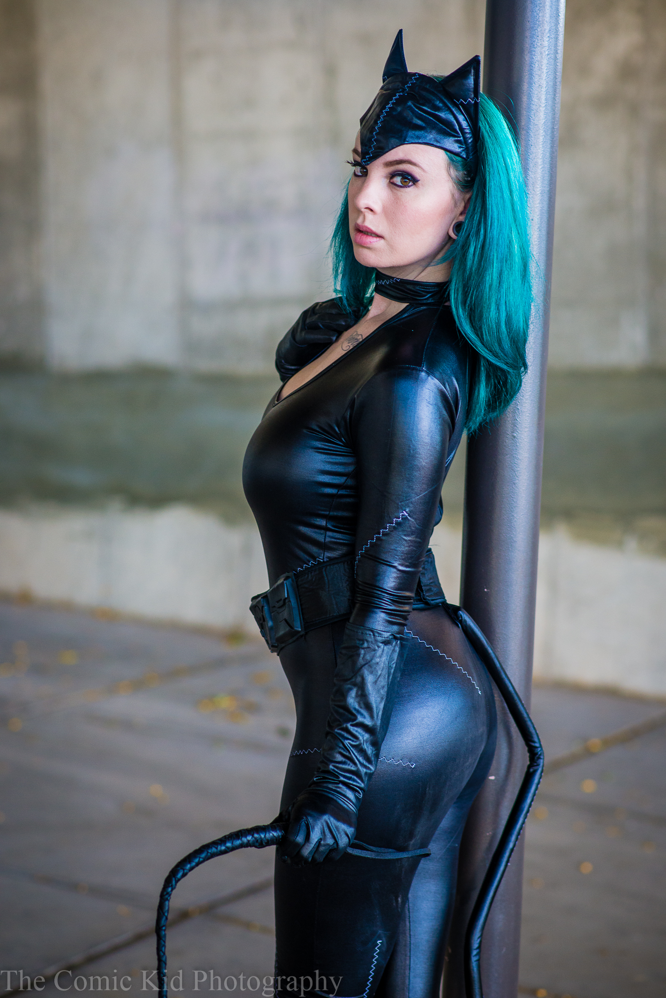
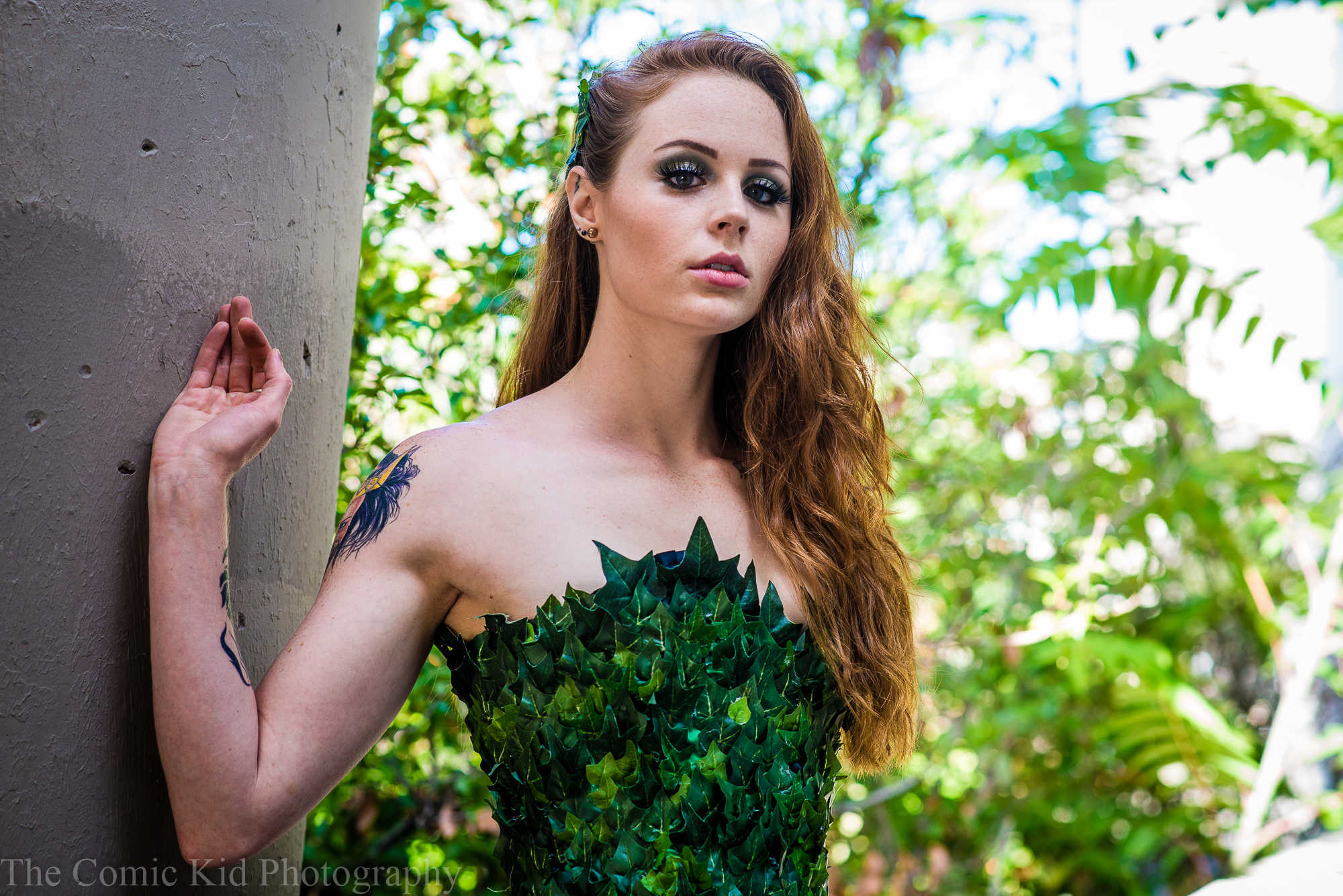
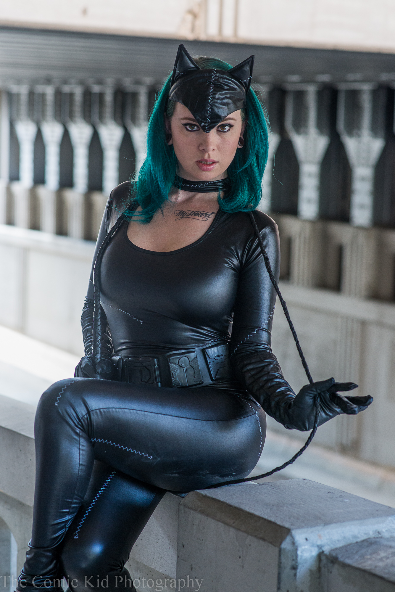
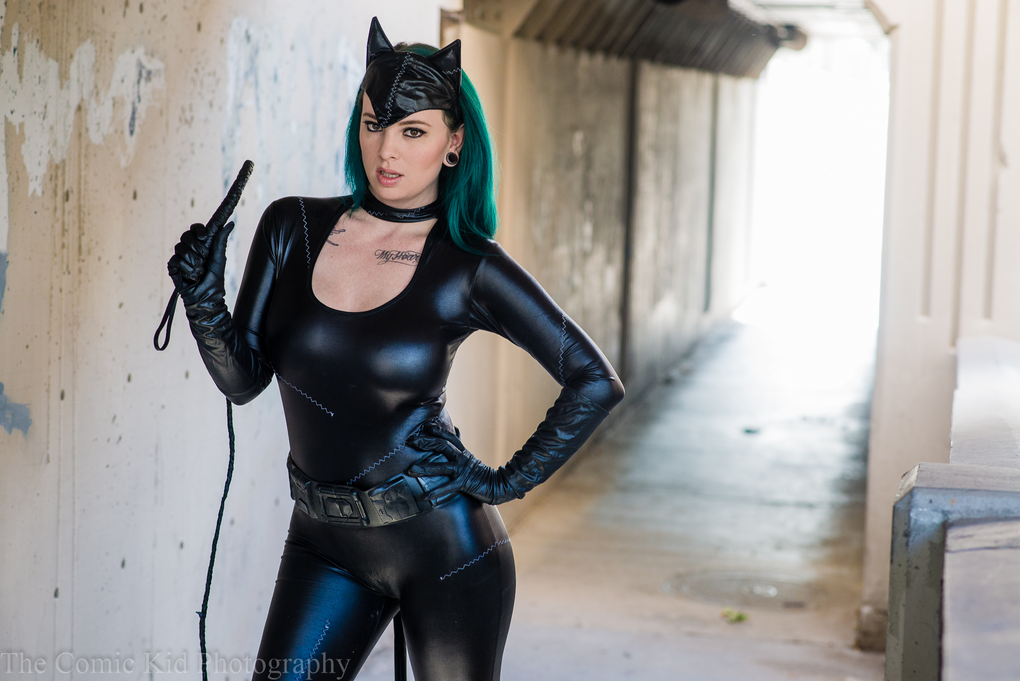
While scrolling through my various social interwebs areas I came across a post by Jenna Lay (scene here as Catwoman) asking if anyone would be interested in shooting a Catwoman and Poison Ivy themed shoot with fellow model Taylor Hayes (Poison Ivy). This being particularly up my alley in terms of things I like to shoot I volunteered. Summer was drawing to a close and I’m never one to turn down and opportunity to shoot.
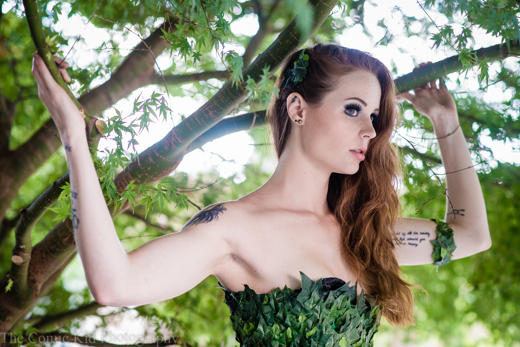
I offered up a location in Downtown Albuquerque that I had previously shot with Tara (See those Photos here) that gave the perfect mix of urban concrete and green plant life which was perfect for the characters we would be representing. It allowed us to be relatively in the same space while at the same time we could get a variety of different looks without going too far which for costume based photo shoots in public areas is a good thing. The over all shoot took less than an hour and didn’t require much gear. Really it was just my standard body and lens set up and me just keeping and eye on my exposure the whole time.
The more and more I shoot the more I can see some of my personal style points becoming drastically prevalent. Especially when I shoot models I want my subject to fill the frame. Props and backdrops should be exactly that back drops. Having the subjects as a the main focus makes it easier for the audience know what they’re supposed to be seeing and not getting distracted by something that draws the eye away. Visually I’m trying to get the sharp areas sharp and the areas that don’t matter soft and bokeh-ee. It’s primarily the reason why I’ve gotten away from using the skin softening brush, I’ve fallen in love with getting a rich level of detail in people’s faces and all that the skin softening tool really does is dull out yours images and make them look like those terrifying dolls your sister had as a kid.

In editing (where the photos come together) I have also come up with a certain style. If anything it amounts to fine tuning of images in lightroom. Adding contrast, pulling shadows, dropping highlights getting exposure balanced out and doing very little to almost no changes to the physical image. I come from a photojournalist background and I refuse to mess with the physical elements of an image. For portraiture I will make some compromises like healing out obvious blemishes and making some changes on request to color especially when wardrobe doesn’t match. But other than that I try to keep the physical space untouched but that’s just me. Some people may not share my same sentiment when it comes to editing and think that’s okay but that’s not what I want to do to my images and I think they are better off that way.
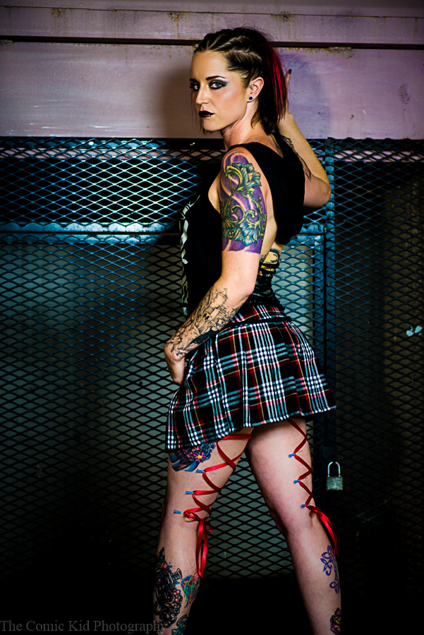
Tara (aka Ravensnow as she’s known on her new modeling page) has long been one of my favorite people to work with since we both started almost 2 years ago. Recently she’s been blowing up working with photographers from all over the state, making friends with a stellar makeup artist known as Stormie Steen and getting spoiled in the process by photographers and re-touchers.
Even though Tara has been making her way up the modeling ladder she still keeps in mind why does it in the first place, for the fun of it. Whenever anyone at our shoots (Me, Tara, my girlfriend Emilie ect.) comes up with an idea whether it be a pose, a prop or even a location or theme, the general consensus is always “fucking go for it.” That’s the kind of attitude that I love when it comes to shooting with Tara.
Everything in the shoot just happened to tie together almost perfectly. Tara’s hair and makeup (Done by Stormie Steen), her wardrobe choices, the location (just a stairwell behind the Albuquerque Convention Center), the prop machete and the corset piercing (Done by Scott Self) all blended together in a very horror-esque Gothic way that also somehow accidentally had a bit of Harley Quinn influences in there (don’t know how it happened but it did.)
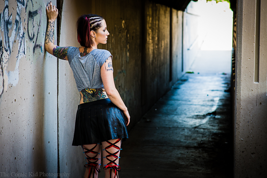
On thing that I wasn’t expecting out of the shoot was how well the location worked out. Location scouting is always difficult and there is always a level of exploration that goes into finding the perfect area. When I was having the conversation with Tara about where we would do the shoot she said she wanted something that looked very dark and abandoned. I remembered the stairwell at the back of the convention center and how it fit that mold perfectly for what she wanted. The climate was very controlled, nobody was ever really around and there was a nearby outlet that I could hook extension cables to in to order to get my lighting kit set up.
What was also perfect was the location outside the stairwell. This was the part that took a little exploration. Right outside the stairwell was a well shaded are with lots of space, Some concrete and even some nature which allowed us to get some other aesthetics in with the set.
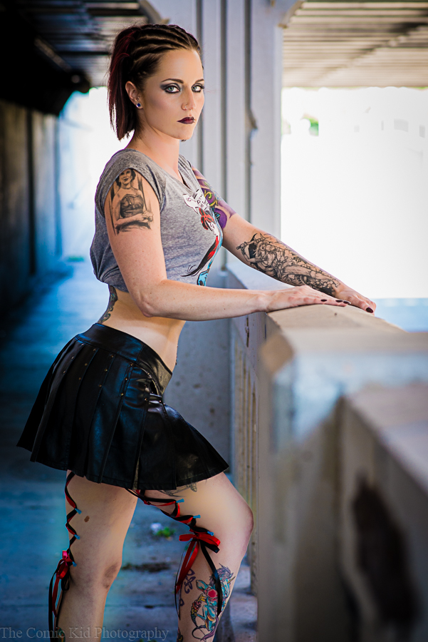
The best thing that came out of the exploration was this sort of tunnel are that ran along the street with it’s own walkway. The lighting that it gave off was unique and perfect for portrait shooting. Of course a lot of it ended up getting blown out in the highlights but in the case of these images it worked extremely well and it’s ads more of an ethereal feel to the images that the stairwell didn’t have. I intend on using this location again in the future, I just need to figure out what that will be.
Editing wise everything was very simple. Stormie’s makeup was so well done that there wasn’t much for me to correct and everything else was my standard contrast and color correcting. Tara of course had some input on the edits this time around. She probably has a more critical eye than I do. I tend to be very conservative with my edits and I’m trying to take in the models input more and more. I need to remember that I don’t necessarily have to follow the same rules for Photojournalism as I do for portraiture.
It was great to be able to work with Tara again and hopefully we both continue to do awesome things, together and separately+, well into the future.
By request of a close friend of mine I went to shoot a live performance of his band. Concert photography can be complicated and difficult because it backs you into corners and the lighting is usually sub par. So with careful edits you can make or break these photos. Watch my Lightroom editing process in the video.
I’ve recently decided to start doing some editing videos using light room to show my editing process. What I like to do, what I don’t like to do and just goof around with the differen’t things I can do with photos.
I’m probably going to start being less formal in these just so I can bring out more of my personality out. There are so many tutorials out there these days that I don’t necessarily want to do what everyone else does.
This is also a part of an Adobe Student Rep program that I’m doing this semester so if you want to get a month free trial of Adobe Creative Cloud you can click this link http://adobe.ly/1jr9L5U and you’ll get access to all of adobe’s creative software to take for a test drive.

You must be logged in to post a comment.